A Bridge, Two Rivers, and One Number That Settles It
What happens to a poor region when you finally connect it to a rich one
Nagoya University (GSID)
August 5, 2026
The Question
Act I
A country cut into three pieces by two of the largest rivers on earth
Bangladesh is a delta. Two rivers cut it into three.
The Jamuna — the local name for the Brahmaputra, ninth in the world by discharge — separated the poor northwest from Dhaka.
The Ganges, locally the Padma, cut off the south.
Two isolated hinterlands. One capital. And, until 1998, no bridge over either river.
In June 1998 one of the two got a bridge
The Jamuna (Bangabandhu) Bridge — 4.8 km, about US$985 million, opened June 1998.
- Connected 26 million people, a quarter of the 1991 population
- Freight costs fell roughly 50%
- Ferry crossing: 3 hours, and up to 36 hours waiting at Eid
- Truck, Bogra to Dhaka: 20 hours → 6 hours
This is about as close to a discontinuous change in trade costs as the real world offers.
Economists disagree, sharply, about what should happen next
- Big push. Integration raises competition and efficiency. The lagging region revives.
- Backwash. Myrdal 1957, Krugman 1991. With increasing returns, the core captures the gains. The periphery is hollowed out.
- Comparative advantage. The region specialises in what it is relatively good at. Factories leave — as specialisation, not decay.
The policy implication flips completely between the first two. And the third looks exactly like the second.
Two of the three theories make the same prediction about factories
| Theory | Manufacturing | Population |
|---|---|---|
| Big push | up, or flat | up |
| Backwash | down | down |
| Comparative advantage | down | up or flat |
Measure only factories and you cannot tell decline from specialisation. The two stories separate on people.
The Design
Act II
The other hinterland is the comparison group, and it stayed isolated
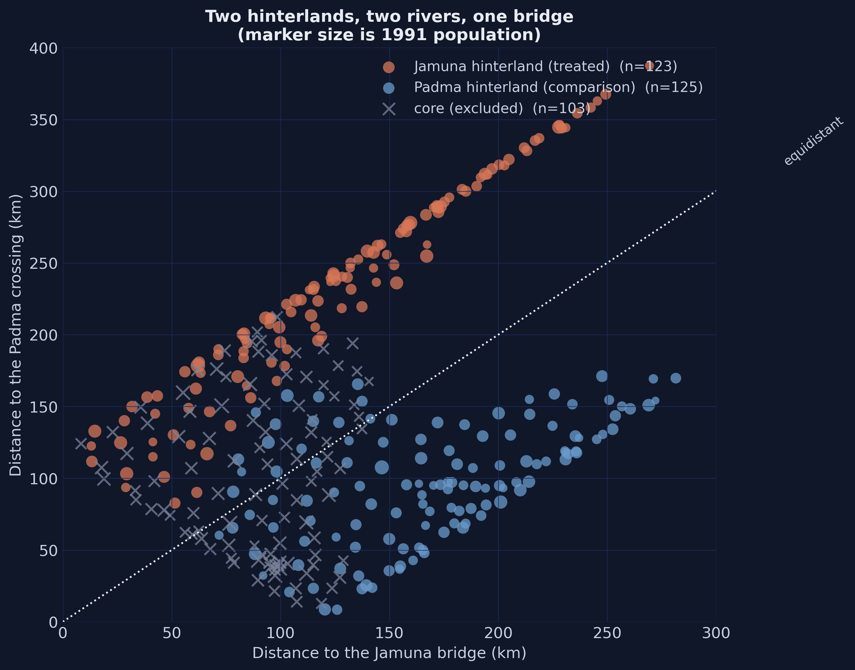
Treated: 123 upazilas in the Jamuna hinterland.
Comparison: 125 upazilas in the Padma hinterland.
The Padma hinterland had the same problem — cut off by a great river — and no solution. Its own bridge was not begun until 2015.
The data end in 2013. The comparison region stayed isolated for the entire study window.
Which river got a bridge first was decided by politics, not economics
- President Ershad’s base: Rangpur — Jamuna hinterland
- Prime Minister Khaleda Zia’s base: Bogra — Jamuna hinterland
- The Padma bridge began only under a PM whose home district is Gopalganj — Padma hinterland
Latitude separation between the two hinterlands: under 3 degrees. Florida spans more than five.
Idiosyncratic political geography, not economic prospects.
The map draws itself without a shapefile
Difference-in-differences is four numbers and two subtractions
\[\widehat{\tau} = \left( \bar{Y}_{J,post} - \bar{Y}_{J,pre} \right) - \left( \bar{Y}_{P,post} - \bar{Y}_{P,pre} \right)\]
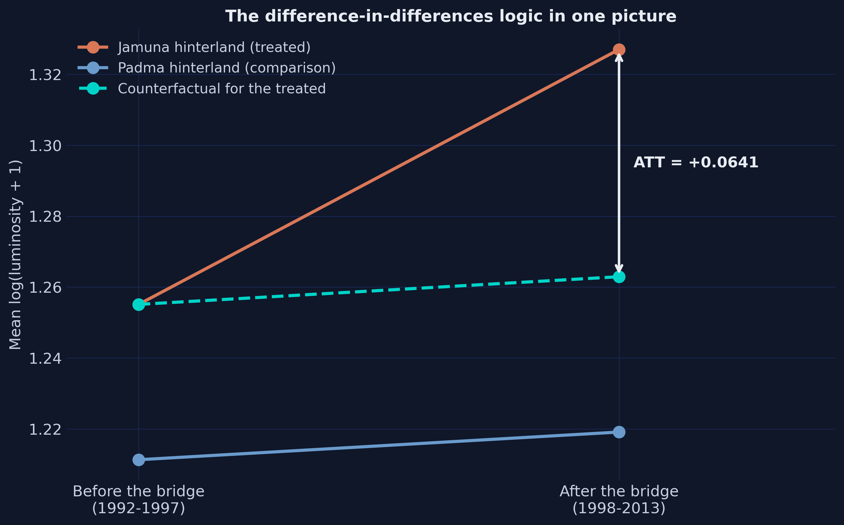
The first difference removes anything permanent about a place — its soil, its size, its distance from the capital.
The second removes anything that hit the whole country — a fertiliser subsidy, a monsoon, a satellite recalibration.
What survives both subtractions is the bridge.
The whole idea, in one picture
The assumption is about trends, not levels — and it is untestable
\[E\left[ Y_{it}(0) - Y_{i,t-1}(0) \mid D_J = 1 \right] = E\left[ Y_{it}(0) - Y_{i,t-1}(0) \mid D_J = 0 \right]\]
Two hikers on parallel ridges, one a hundred metres higher. As long as the terrain runs parallel, you can measure what a helicopter lift did to one of them.
It says nothing about levels. And because it describes a world that never happened, no test can confirm it.
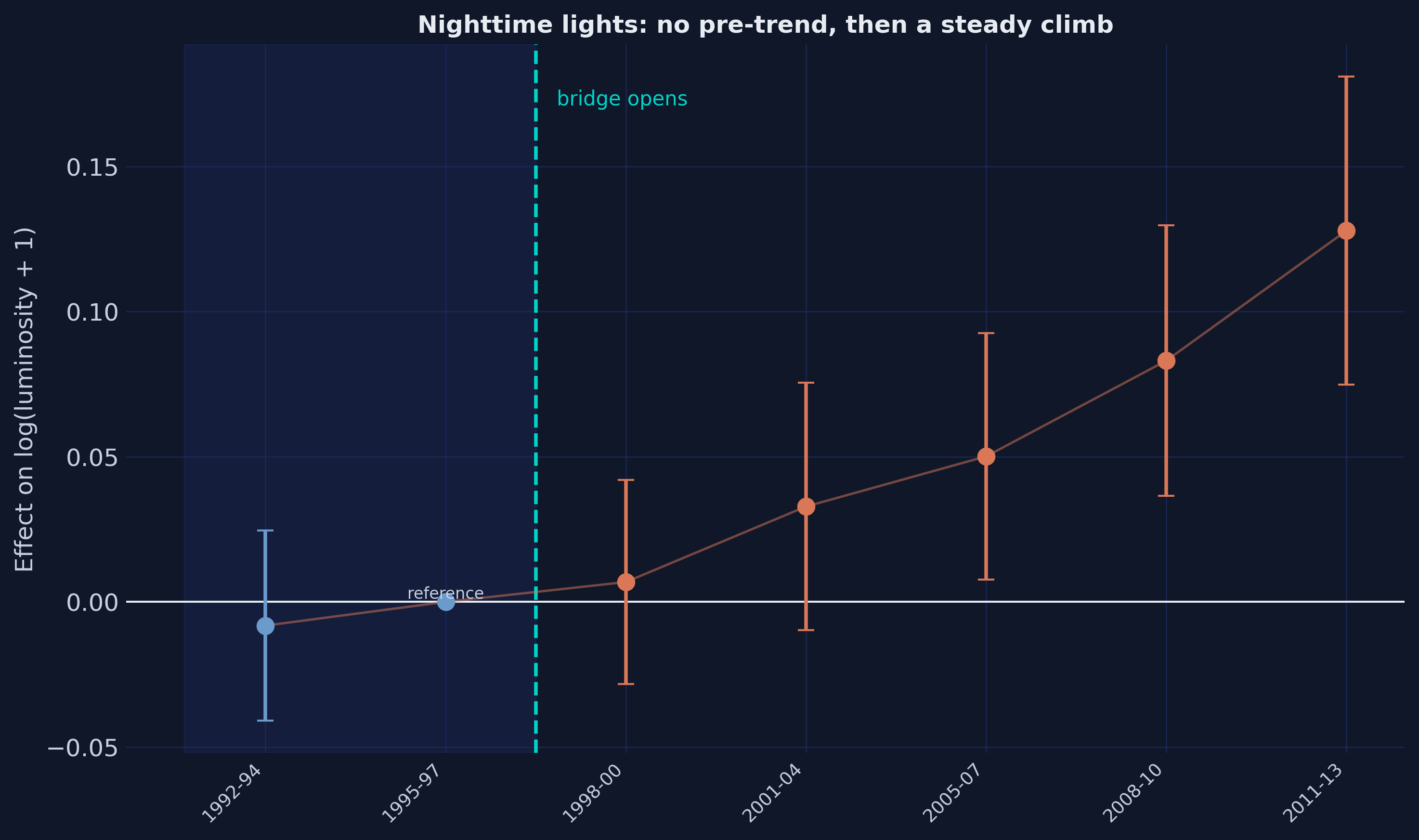
Every period gets its own coefficient, and the ones before the bridge are a test
What would a confounder have to look like?
Pre-bridge: −0.008 (se 0.017). On zero.
Then: +0.7% → +3.3% → +5.0% → +8.3% → +12.8%
A confounder producing this would have to be absent before June 1998, appear at exactly the right moment, and then grow steadily for fifteen years without reversing.
Such things exist. The list is short.
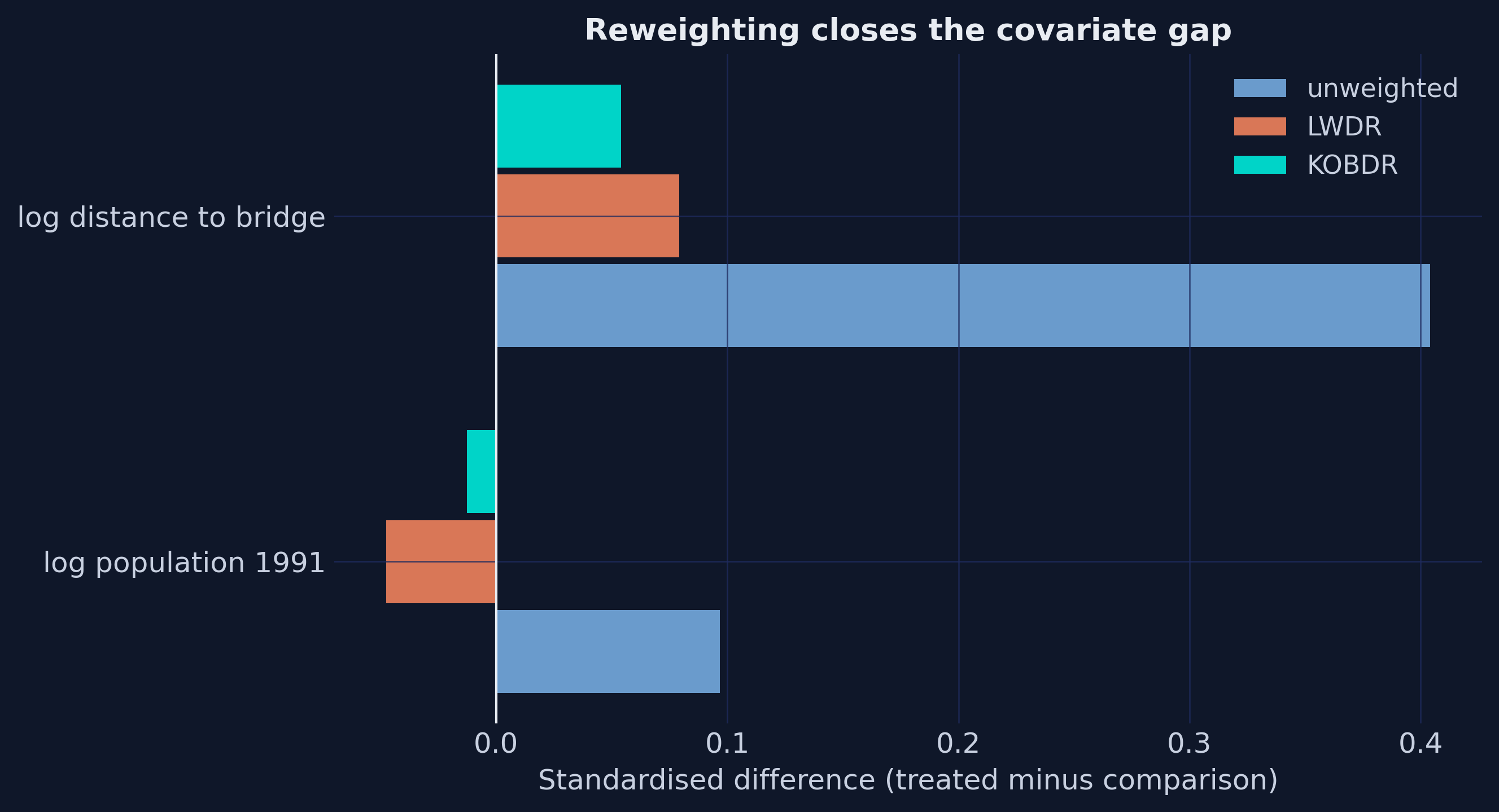
Reweight the comparison group so it resembles the treated one
- LWDR — weight each comparison unit by its odds of having been treated
- KOBDR — Kline’s Oaxaca-Blinder projection of the treated covariate mean onto the comparison design
- Both put weight exactly 1 on treated units. That is what makes them ATT weights.
- Both also enter the covariates in the regression — hence doubly robust
A main chute and a reserve. Only if both models fail does the estimate fail. But two chutes do not help if you jumped over the wrong country.
The reweighting closes a gap that was genuinely open
What The Data Say
Act III
The bridge raised activity across the board
| Outcome | Effect | |
|---|---|---|
| Nighttime lights | +10.9% | (se 0.022) |
| Rice yield | +6.3% | (se 0.023) |
| Services employment share | +2.3 pp | (se 0.005) |
| Manufacturing employment share | −1.0 pp | (se 0.004) |
| Population density | +2.5% | (n.s.) |
That manufacturing number looks negligible. The 1991 baseline share was 2.8%.
A 1.0 point fall removes roughly a third of the sector.
Then split the post-bridge period in two, and one outcome reverses sign
| Outcome | Short run | Long run |
|---|---|---|
| Nighttime lights | +4.9% | +11.2% |
| Rice yield | +1.2% (n.s.) | +7.9% |
| Population density | −2.5% | +5.9% |
| Manufacturing share | −0.6 pp (n.s.) | −1.2 pp |
| Services share | +2.0 pp | +2.4 pp |
People left first. Then more came than had left.
The discriminating test
Manufacturing fell 1.2 percentage points. Backwash predicted that. So did comparative advantage.
Backwash also requires the region to be emptying — capital and labour both leaving for the core.
Population density: +5.9%, se 0.016, significant at the 0.1% level.
The region gained people while losing factories. Backwash is rejected. The Jamuna hinterland did not decline — it specialised.
The average effect hides almost everything interesting
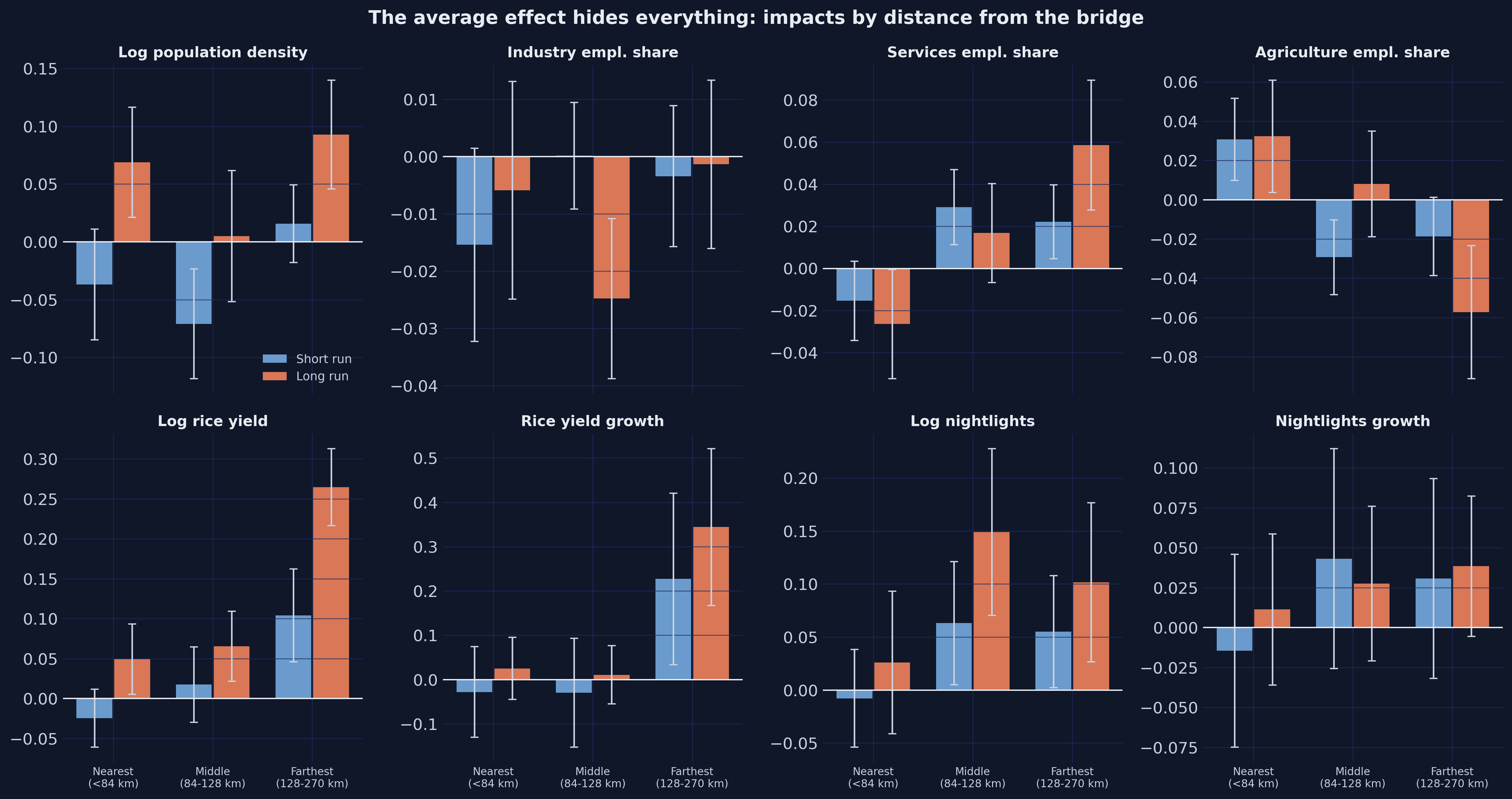
The gains land at the end of the line, not next to the bridge
| Outcome, long run | Nearest | Middle | Farthest |
|---|---|---|---|
| Rice yield | +4.9% | +6.5% | +26.5% |
| Services share | −2.6 pp | +1.7 pp | +5.9 pp |
| Agriculture share | +3.2 pp | +0.8 pp | −5.7 pp |
But the nearest upazilas got the largest proportional cut in travel time — about 40%, against 17% at the far end.
Why do the distant places gain more?
Because trade responds to the level of the barrier, not the percentage change in it
A 40% cut on a ten-dollar taxi ride saves four dollars.
A 17% cut on a five-hundred-dollar flight saves eighty-five.
Upazilas near the bridge foot were already reasonably connected — the ferry was an inconvenience, not a wall.
Upazilas 250 km out were close to autarky, where fertiliser rarely arrived and rice rarely left.
An evaluation reporting only the average tells a minister to build near the demand centre. The heterogeneity says the payoff was at the end of the line.
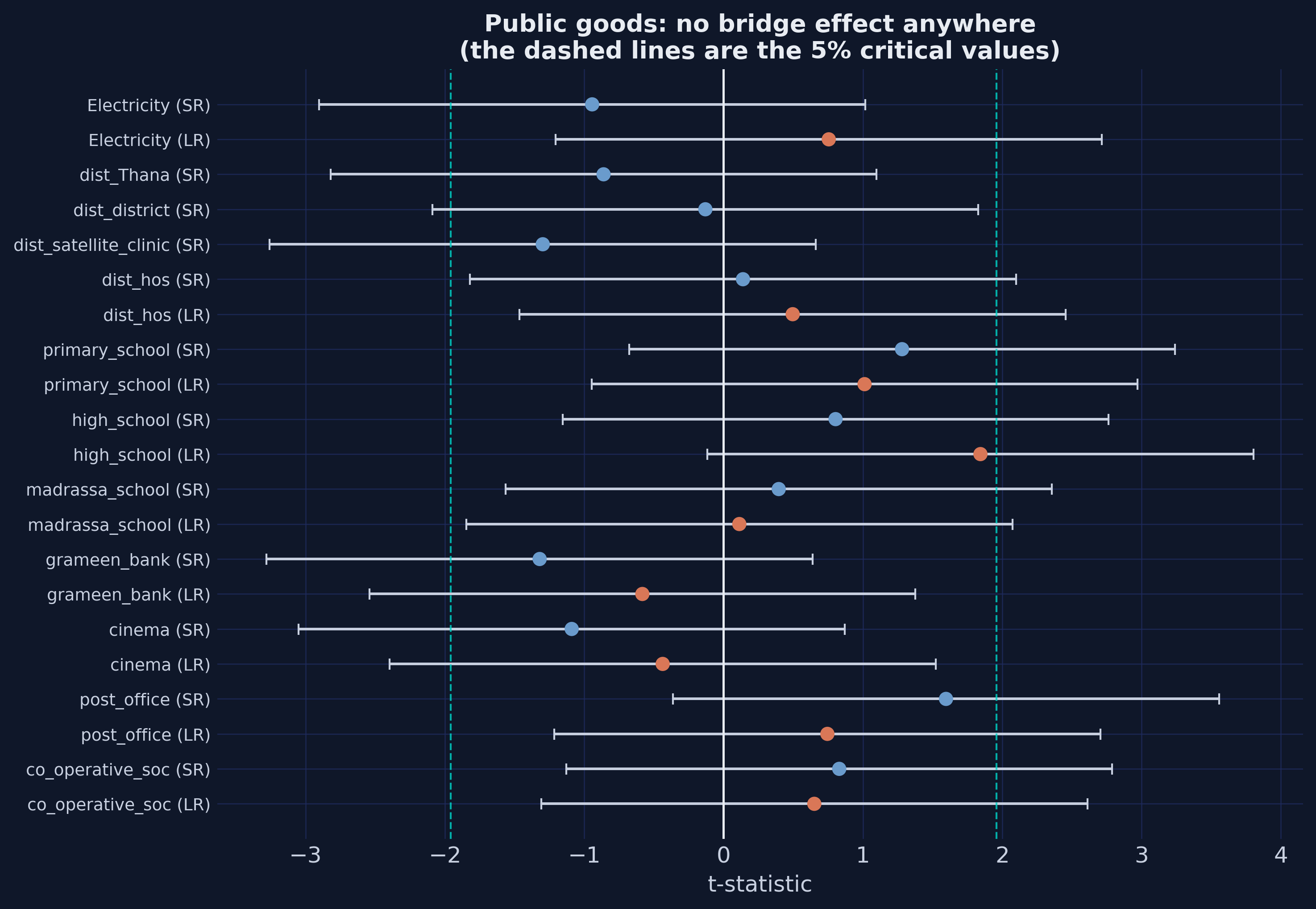
Could it just have been politics?
How wrong could parallel trends be before this dies?
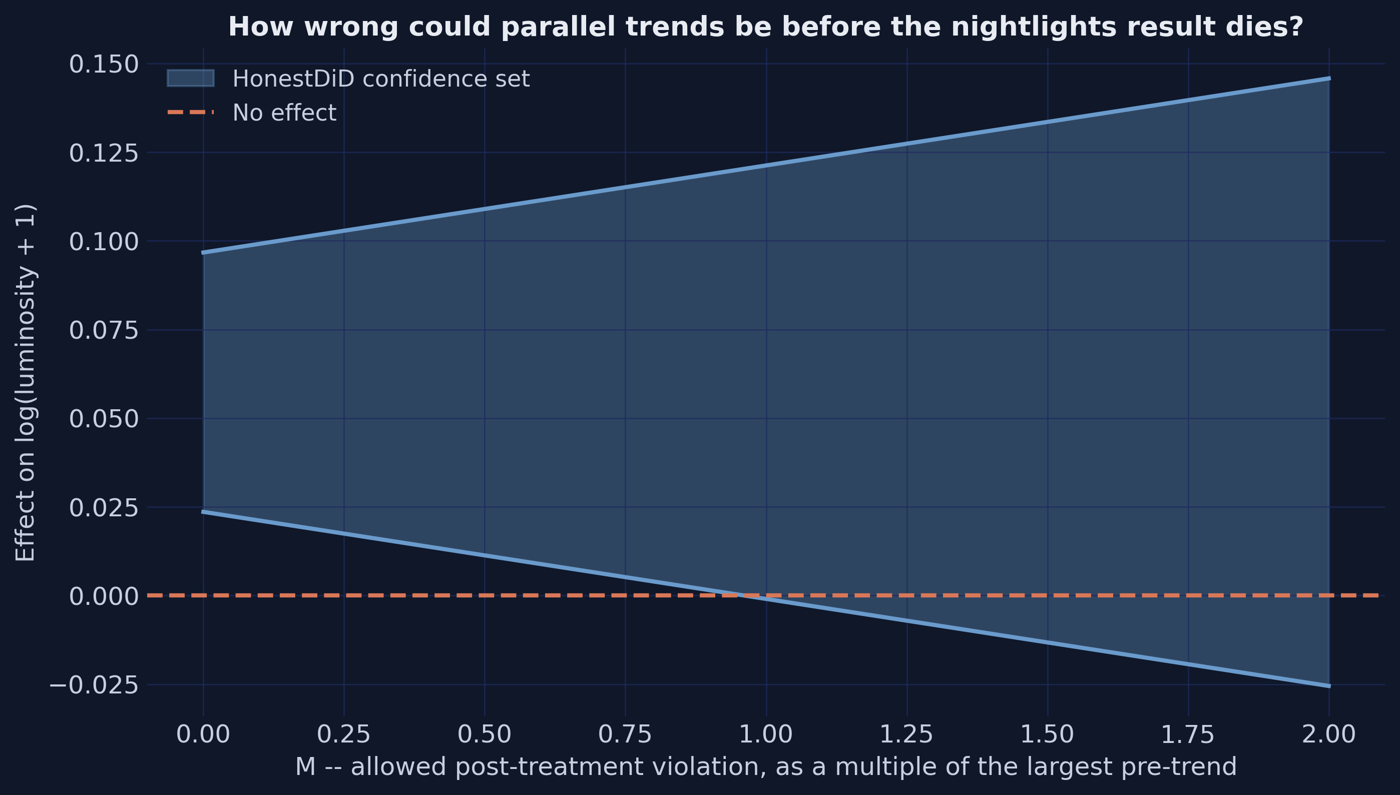
The honest answer is “moderately”
- Breakdown value: just under M = 1
- The post-bridge violation would have to be as large as the largest pre-bridge violation to overturn the result
- Randomisation inference over 500 placebo assignments: not one draw reaches the real estimate
- Placebo timing, moving the bridge one period early: +0.008 against the real +0.064
A result surviving to M = 3 would be much stronger. One breaking at M = 0.3 would be fragile. This sits in between — and that is worth saying out loud.
What Replication Taught Us
Act IV
All 122 published coefficients reproduce
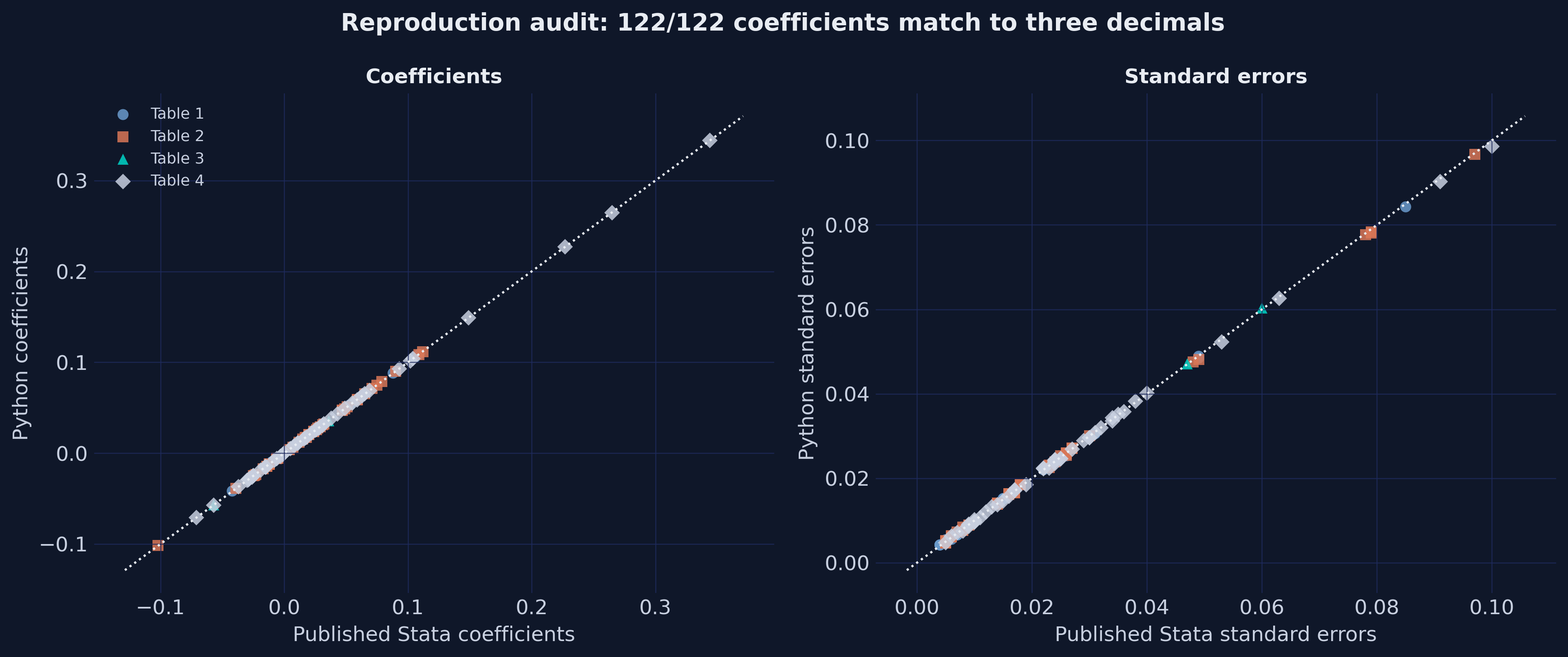
Getting there took three specific pieces of care
ln(0)must become missing, not-inf. Twenty-four rows have zero rainfall. Stata drops them; NumPy keeps them, and nothing matches.- The dof correction excludes the fixed effects. Counting them inflates every standard error by about 20 percent.
- Distance terciles are cut at different points in different do-files. One drops missing rows first; the other does not. That alone moves every heterogeneity coefficient in the third decimal.
None of these produce an error. All three produce wrong numbers quietly.
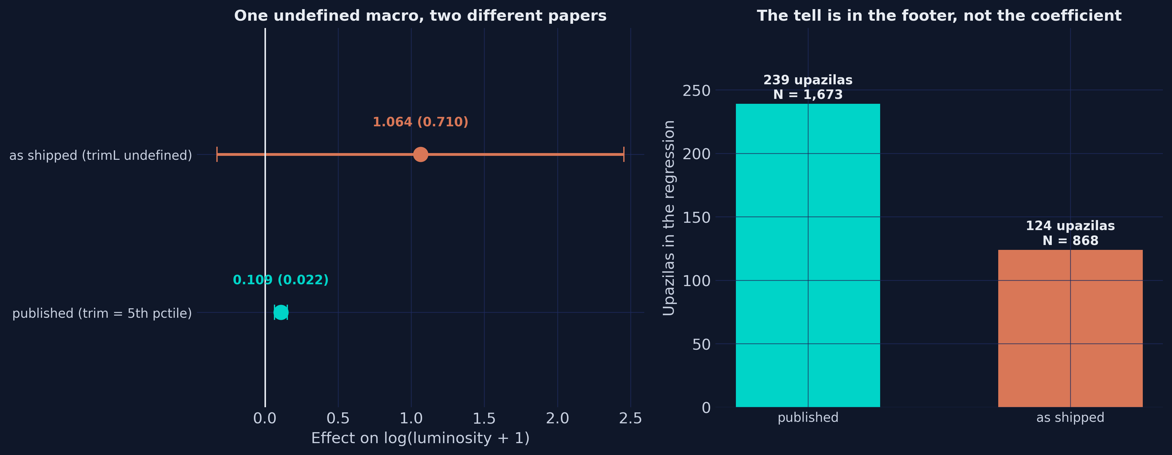
One undefined macro turned 0.109 into 1.064
Every step is legal Stata and nothing warns
global trimLis never defined in that do-filegen cut11 = r(p$trimL)expands tor(p), which does not exist → cut11 is missingreplace ipw4 = . if p < cut11— in Stata, any number is less than missing → fires for every comparison unit- The regression runs on treated units only
- It prints 1.064 (se 0.710)
The tell is not the coefficient. It is the footer: 124 upazilas where there should be 239.
The paper’s conclusions all survive — and that is the point
Nothing found in the package changes a single conclusion of the paper.
But notice what made each finding possible: the authors shipped the buggy output and the corrected output. They shipped the intermediate tables. They shipped the data.
A paper that published only its conclusions would be opaque on every count. This one is unusually checkable — which is exactly why a 122-of-122 reproduction was possible at all.
Four things to take away
- The assumption is about trends, not levels — and no test can confirm it. Bound the violation instead of testing for it.
- Averages hide reversals. Density was insignificant on average because it was negative then positive. Split by time and by space before believing a null.
- When two theories predict the same sign on your headline outcome, go find the outcome where they disagree. Here it was one extra variable from a census already sitting there.
- Read the sample size first. It is the only thing that would have caught the worst bug in this package.
Everything here is runnable today
diff-diff— the DiD engine used throughout: 2x2, TWFE, event study, HonestDiD, placebo suitepyfixest— the independent cross-check. All three engines agree to nine decimals.- Five datasets, tidy CSVs, committed with the post
- A Colab notebook, a Quarto bundle, an interactive web app, and a Stata companion
- The full post: carlos-mendez.org/post/python_bridge_impact