Prosperous and lagging regions cluster on the map — but is the pattern real?
Map human development across South America and a pattern jumps out: rich regions sit next to rich, poor next to poor.
But the eye is easily fooled. Is this clustering statistically significant, or could it arise by chance? And how does it move over time?
One dataset, two snapshots: 153 regions, 12 countries, six years apart
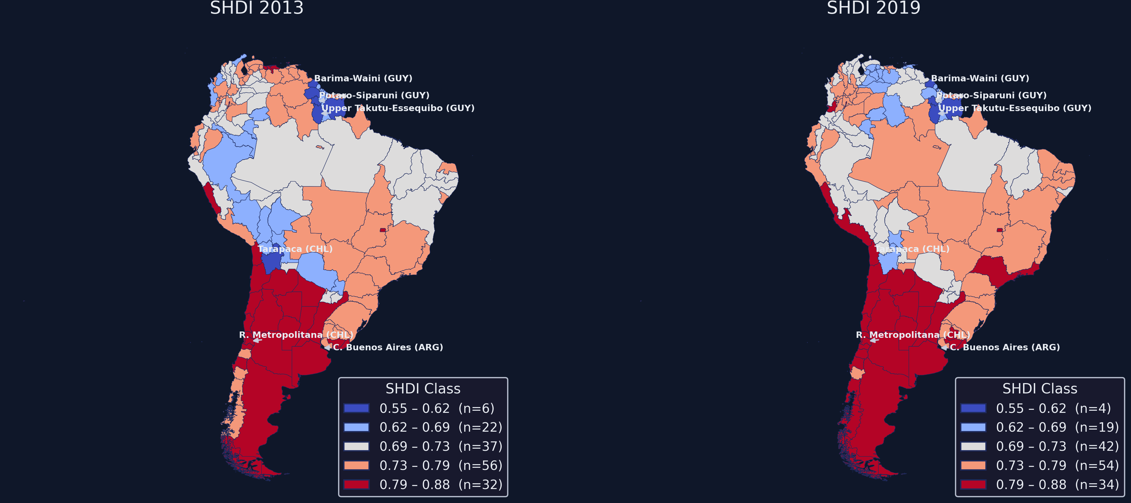
Subnational HDI in 2013 vs 2019, Fisher–Jenks classes held constant. The Southern Cone (red) and the Amazon–Guyana band (blue) read as spatial blocks, not scatter.
Where we’re going
The lab: a 153-region, two-period panel of subnational HDI
Spatial weights — defining who is a “neighbour”
Global Moran’s I — one number for the whole map, tested by permutation
LISA — where the clusters actually are
Space–time dynamics — how the clusters moved, 2013 to 2019
The Investigation
Act II
The lab: subnational HDI for 153 regions across 12 countries, 2013 and 2019
Outcome — the Subnational Human Development Index (SHDI), plus its Health, Education, Income components
Geography — polygon geometries for 153 sub-national regions, 12 South American countries
Two snapshots — 2013 and 2019, the same data as the Pooled-PCA tutorial
Source: Global Data Lab (Smits & Permanyer, 2019). Mean SHDI rose only \(+0.0053\) overall — yet income fell in 71 of 153 regions (46.4%). The aggregate calm hides spatial turbulence.
Spatial autocorrelation has no meaning until you define “neighbour”
A spatial weights matrix\(W\) is an \(n \times n\) array whose entry \(w_{ij}\) encodes the link between regions \(i\) and \(j\) — \(w_{ij}>0\) if they are neighbours, \(0\) if not.
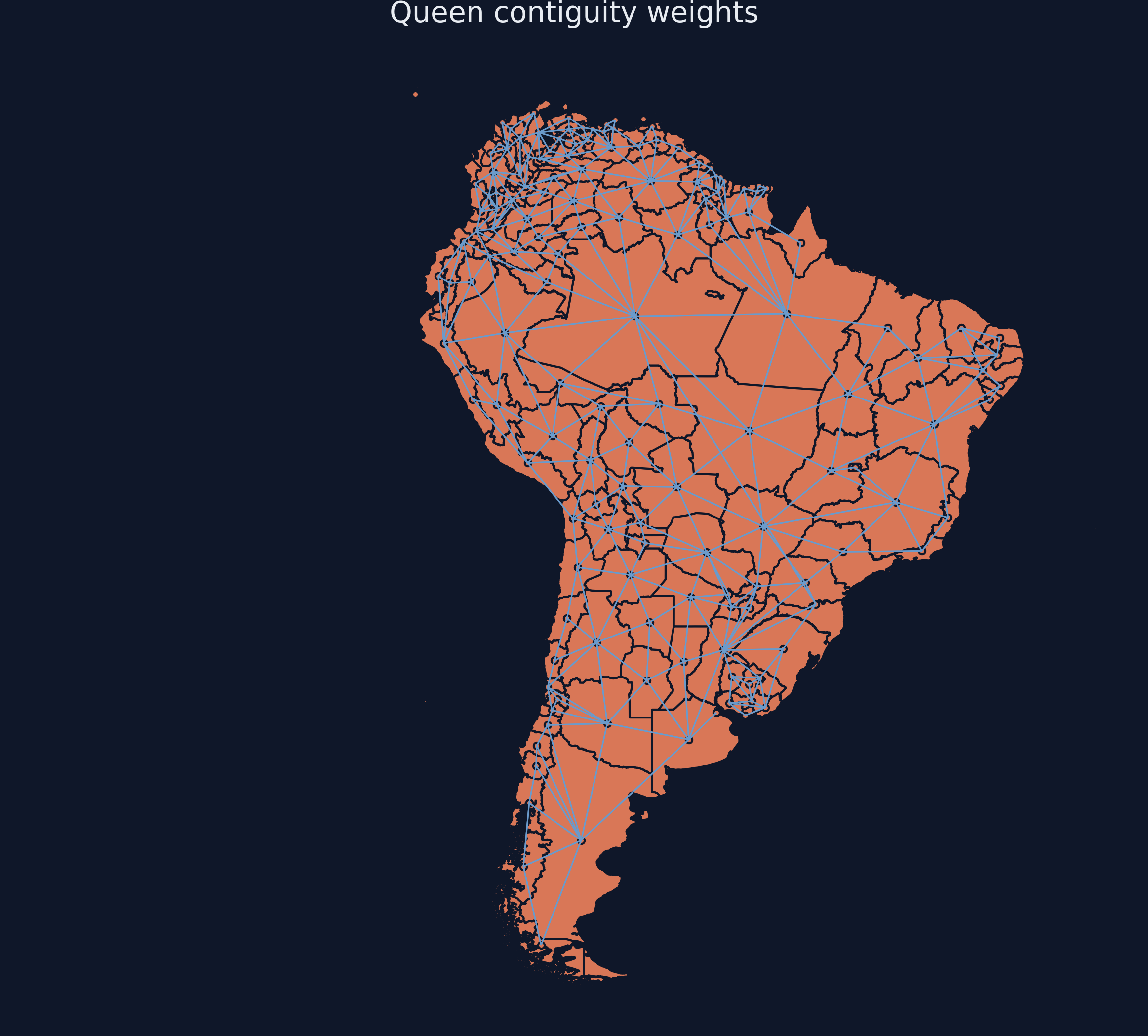
Queen contiguity
neighbours if they share any boundary point — even a corner
the broadest, most forgiving rule
Rook contiguity
neighbours only if they share an edge
stricter; drops corner-only touches
We use Queen — appropriate for irregular administrative borders. Then row-standardize (\(w_{ij}\to w_{ij}/\sum_j w_{ij}\)) so each row sums to 1.
Queen contiguity links 153 regions with 4.93 neighbours on average — two islands left isolated
Queen-contiguity network over South America: a line joins each region’s centroid to every neighbour’s. Dense in southern Brazil and northern Argentina; sparse in the Amazon.
Moran’s I asks one question: do like values sit next to like values?
For each pair of neighbours it multiplies their deviations from the mean. High-next-to-high (and low-next-to-low) makes the products positive — so \(I>0\) means clustering.
We test I by shuffling the map 999 times — no normality assumption needed
A permutation test reshuffles all SHDI values across regions 999 times — like dealing cards to random seats — and asks how often a random map beats the real one.
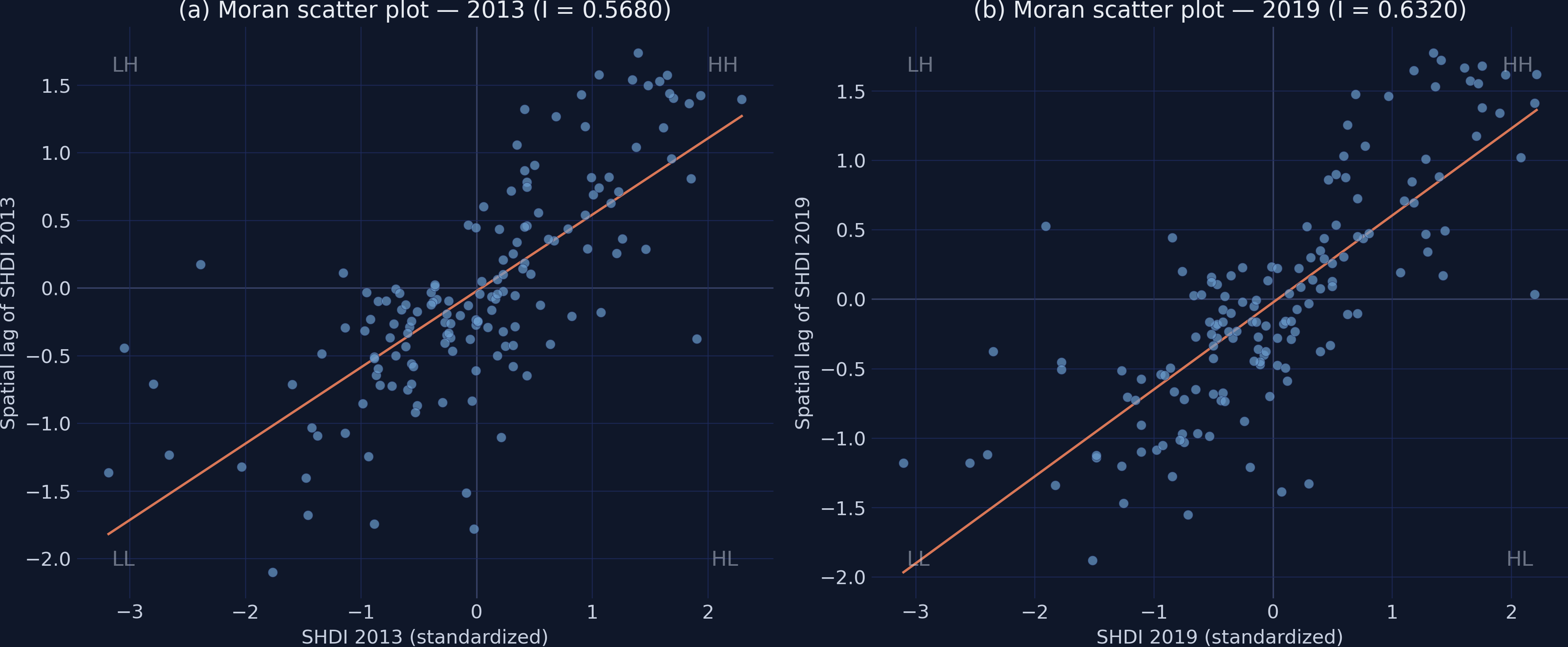
Both years cluster strongly — and the clustering strengthened: I rose 0.568 → 0.632
Year
Moran’s \(I\)
\(p\) (perm.)
\(z\)
2013
0.5680
0.0010
10.77
2019
0.6320
0.0010
11.99
Expected \(I\) under randomness \(= -0.0066\). The observed values are an order of magnitude away — and 2019 is higher than 2013.
The Moran scatter plot turns I into a picture: its slope is Moran’s I
Standardized SHDI (\(z_i\)) vs spatial lag (\(Wz_i\)), 2013 and 2019. The orange regression line’s slope equals \(I\); the steeper 2019 line shows the rise. Most points fall in the HH and LL quadrants.
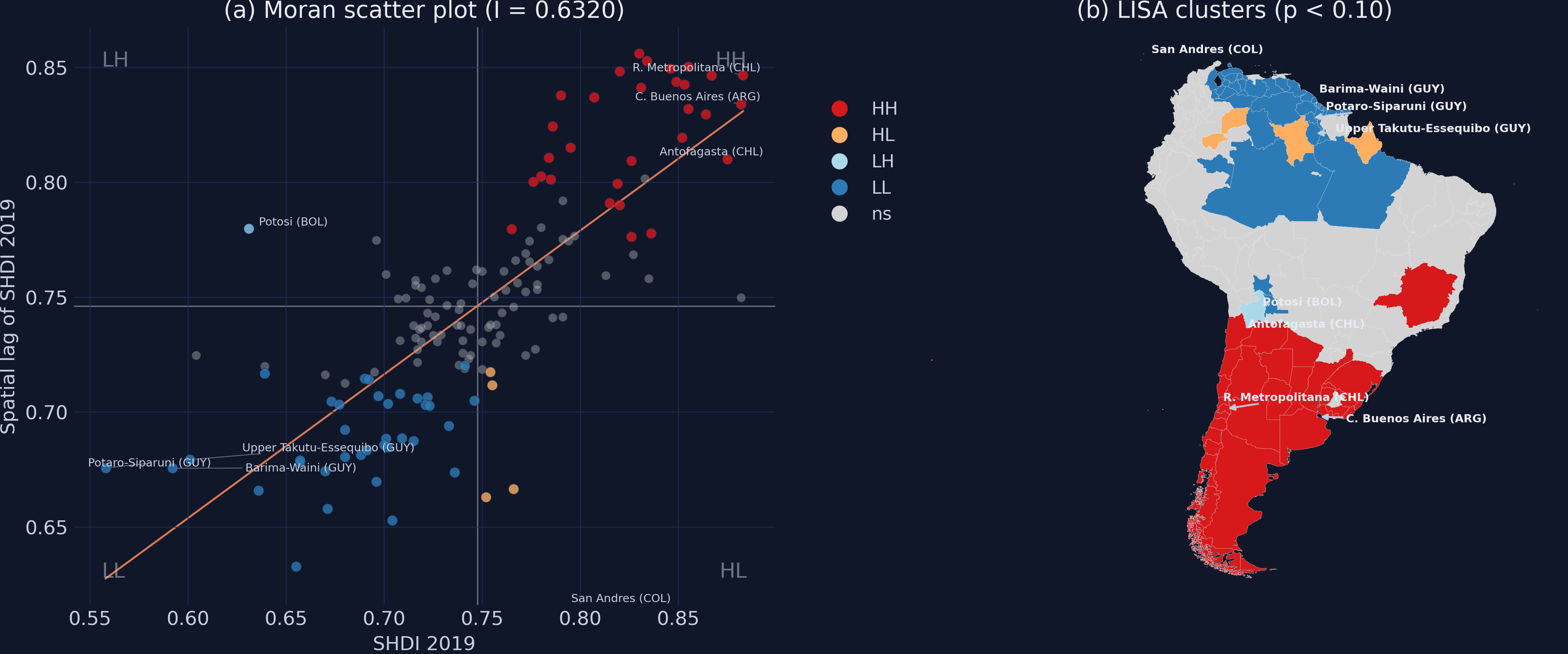
Global I says clustering exists — LISA says where it lives
The local Moran statistic decomposes the global \(I\) into one value per region:
\[I_i = z_i \sum_{j} w_{ij} z_j\]
Each region’s own standardized value \(z_i\) times the average of its neighbours’ — large and positive in a cluster’s core, negative for a spatial outlier.
Four cluster types — two hot/cold cores and two rare outliers
Significance is permutation-based: only regions with \(p<0.10\) are coloured; the rest stay grey.
LISA pins the clusters: 30 HH in the Southern Cone, 37 LL in the Amazon–Guyana band
LISA for SHDI 2019: Moran scatter coloured by significant quadrant (left), cluster map (right). HH (red) clusters in the Southern Cone; LL (blue) across Guyana and the Amazon.
The cold spot is spreading: the LL cluster grew 29 → 37 while HH held steady
2013
HH: 31
LL: 29
HL: 5 · LH: 0
2019
HH: 30
LL: 37
HL: 5 · LH: 1
Prosperity clusters stable; deprivation cluster expanding by 8 regions. Asymmetric evolution — the signature of a localized crisis.
87% of hot spots persist; the growth is all at the cold end
87%
of 2013 HH regions were still HH in 2019 (27 of 31) — while 17 non-significant regions fell into the LL cluster
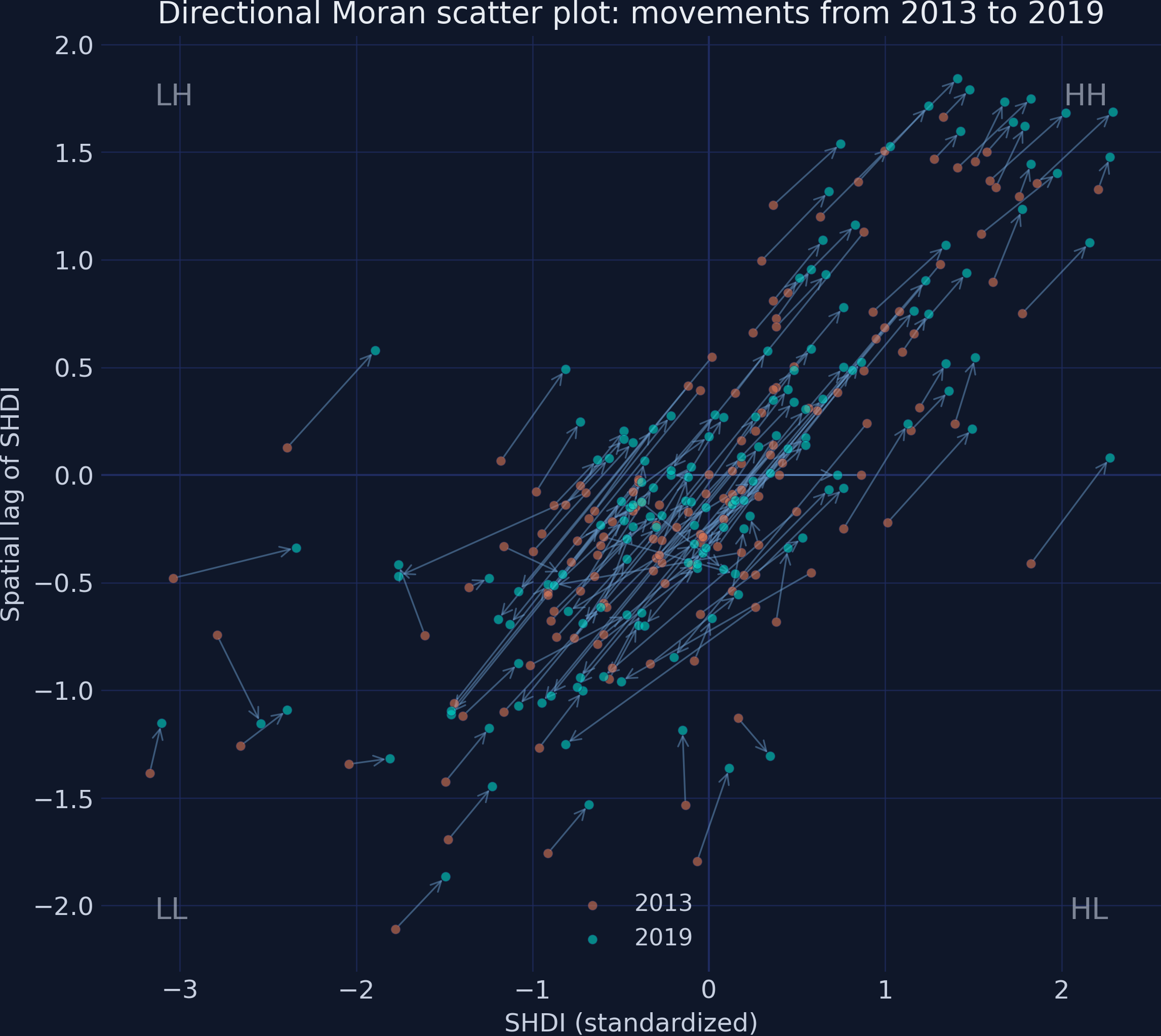
Regions move within the scatter even without crossing significance — track the vectors
Directional Moran scatter: an arrow from each region’s 2013 position to its 2019 position in (standardized value, spatial lag) space. Orange = 2013, teal = 2019.
The Resolution
Act III
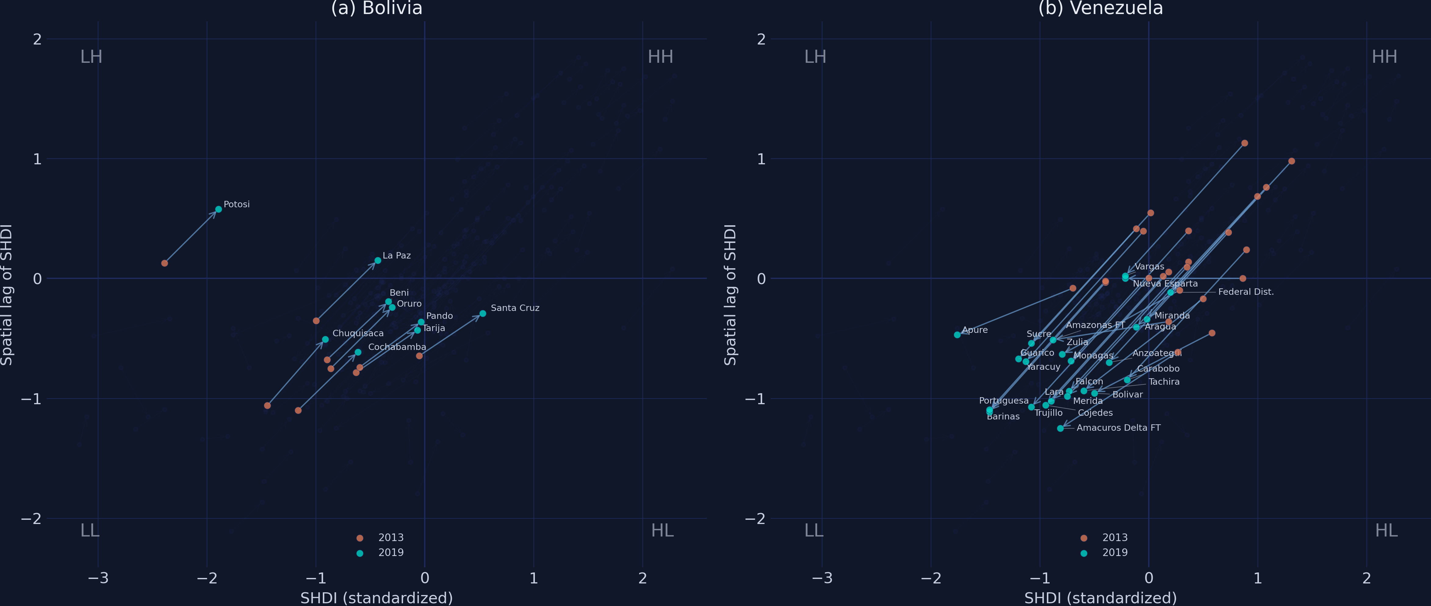
Two countries, opposite engines: Venezuela collapses uniformly, Bolivia climbs steadily
Directional Moran scatter, Bolivia (left) vs Venezuela (right). Bolivia’s arrows are short and rightward; Venezuela’s are long, bundled, sweeping southwest into LL.
Venezuela’s 24 regions fell almost uniformly — 88% crossed into a worse quadrant
−0.065
mean SHDI change across Venezuela’s 24 regions; 21 of 24 ended in the LL quadrant (range a tight −0.067 to −0.064)
A country that climbs alone stays trapped: Bolivia gained +0.033 yet never left LL
Country
\(n\)
Mean change
Quadrant stability
Bolivia
9
+0.0333
7 of 9 stayed (78%)
Venezuela
24
−0.0653
3 of 24 stayed (12%)
Bolivia’s arrows point right — own development improved — but its neighbours stayed poor, so it remained inside the LL cold spot.
Does positive Moran’s I make this a causal claim? No — it is description, not identification
Objection. “Spatial clustering proves neighbours cause each other’s development.”
Response. No. Moran’s I and LISA are descriptive — they measure spatial pattern, not mechanism. Clustering can come from genuine spillovers, from shared regional shocks, or from omitted common factors. ESDA flags where to look; identifying why needs a spatial regression and an identification strategy.
What ESDA bought us: a deepening divide invisible to aspatial summary statistics
Aggregate SHDI barely moved (\(+0.0053\)) — yet \(I\) rose from 0.568 to 0.632
30 HH and 37 LL significant clusters; the cold spot grew by 8 regions
87% HH persistence — prosperity corridors are structurally locked in
The Venezuela–Bolivia contrast shows clusters expand by contagion, shrink only by slow internal climb
Let the map speak: a flat average can hide a deepening, spatially contagious divide.